
Twenty years ago, I was in the market for a new car. I wanted a mid-size sedan that was safe, reliable, and had good fuel economy. I gathered data from NHTSA and the EPA and combined it with reviews and reliability assessments from Edmunds, Car & Driver, and other resources. I had a lovely spreadsheet with all of the characteristics I cared about for every mid-size sedan on the market. The Honda Accord and Toyota Camry were at the top of the list. At the time, the Accord had a combined fuel economy of 24 MPG, and the Camry was at 26. The average for the ten best-selling cars that year was 22.1, so these were both very good numbers.
This year, the average fuel economy among the ten best-selling mid-size sedans in the United States is 31.4 MPG. That’s not counting the hybrid versions of four of those models, which have an average of 50.5 MPG. By comparison, those efficient 2004 cars are not just below average, they’re at the bottom of the list. The scale for what constitutes a “fuel-efficient car” has shifted significantly in the last 20 years. Even among traditional gas-only cars, the bar is about 35% higher than it was a generation ago. The pressure caused by improved fuel economy has changed the way we compare cars and has redefined our perception of “fuel-efficient.”
I was thinking about this a couple weeks ago when a presenter shared the All Sides Media Bias Chart at a conference I was attending. This is version 9.2, from late 2023:
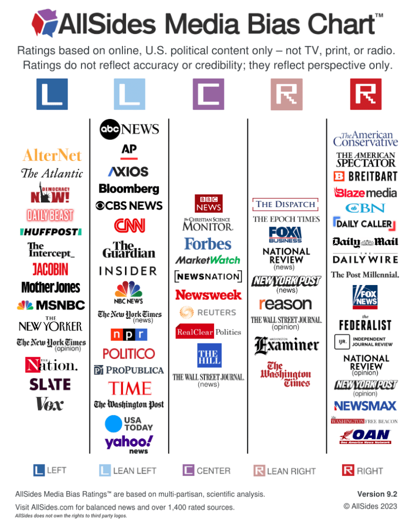
The context in the presentation was the need to identify and assess bias in information resources. We’ve been working on that for a long time. We certainly understand the need to recognize bias in our sources of information, and use it to guide how we assess the reliability of the media we’re consuming. All Sides is a great resource for helping with that. In addition to the bias chart, they have a neat tool that shows you how news items are reported, amplified, or diminished depending on the perspectives of the reporting entities. It’s helpful to see this stuff again, especially now, but it’s not new.
When consuming news, I try to get my information from the least biased sources possible. I don’t trust Fox News as a news resource (because it’s not), but I also don’t get the majority of my information from Mother Jones or HuffPo. For the last several years, I’ve relied on the Associated Press, Reuters, the New York Times, and NPR for reliable reporting.
But looking at the chart now, nearly all of those sources are left leaning. Surely that hasn’t always been the case, right? I remember selecting the AP, in particular, because of its LACK of bias. So I looked up an old chart. This one is version 1.0, from 2019:

So what do you notice? Five years ago, the Associated Press was in the center column. So were Bloomberg, NPR, and USA Today. Now, they’re all classified as left leaning. In all, 13% of the news outlets moved left between 2019 and 2024, while only one (Fox News) moved right.
Like fuel economy, the scale has changed. I know the news media landscape is in a constant state of flux. But in five years, did the Associated Press, Bloomberg, National Public Radio, USA Today, The Atlantic, the New York Post (!), and National Review ALL suddenly become noticeably more liberal, while only Fox News moved to the right? That seems pretty unlikely.
Take a look at that far right column. In 2019, there were 12 items there. In 2023, there were 17. The pressure from the far right is changing the definition of “neutral”. All Sides includes top news outlets in terms of traffic, as defined by the Pew Research Center and Similiarweb. But they also include outlets that are good representations of certain perspectives or ideology. These aren’t necessarily based on popularity or traffic.
This isn’t just limited to All Sides. The more comprehensive (but also more confusing) Ad Fonts Media charts show a similar trend. Over the last five years, news that was previously considered unbiased is now left-leaning, because there’s a new flood of extremist right-wing media that’s changing the definition of “center.” The sheer volume of resources listed on the Ad Fonts chart is alarming. They’re at the point where they can’t even list them all on the chart.
This was all a lot easier before we politicized information literacy. When ridiculous email chains and Facebook memes got posted, we could just point to point to Snopes to debunk the crazy, and move on with our lives. But in an environment where we can’t agree on the definitions of words like “fact” and “truth”, it shouldn’t be a surprise that there are bias ratings on the fact checkers, too. Snopes is left-leaning propaganda now, along with CNN, the AP, New York Times, NPR, Politifact, USA Today, and the Washington Post. So while I may trust those resources, it’s increasingly unlikely that the purveyors of disinformation or their followers will be willing to acknowledge the fallacies pointed out by the previously-unbiased fact-checkers.
I keep going back to the old quote from Fisher Adams (and widely attributed to others as well): “Men are not to be reasoned out of an opinion that they have not reasoned themselves into.”
It’s going to be a long year, folks.

One thought on “Shifting Bias”
Comments are closed.