
I’m fascinated by the Corona virus crisis. I’m not sure why, really. This sort of thing has never been my thing. I’m not a doctor. I hated high school biology. I have no expertise in this area. I’m afraid of needles. I wasn’t particularly worried about SARS or H1N1 or Mad Cow disease. We’ve had health threats and global crises before. In schools, we’ve even made plans to deal with potential pandemics. But it always seemed like such a remote threat. Do we really think 20% of our students are going to be infected with the disease? Is it really that deadly? Ae we actually going to close schools and stores and concert halls and amusement parks because everyone is afraid they might catch the disease? It all seems so irrational. And yet, here I am.
 About a week ago, I started looking at this fantastic data visualization maintained by the smart folks at Johns Hopkins. That was around the time when all of my circles started to converge on this one topic. The CDC was saying “y’all might want to ask your schools what their plans are for this.” Meanwhile, our state educational technology email list was blowing up with people trying to make plans. Reddit forums and Facebook posts soon followed. By Monday, it was on everyone’s mind. I had four different meetings about it last week.
We made some plans. We sent out some communications. We’re trying to be measured and thoughtful and reasoned. But there are lots of unknowns. And no, going from mostly-classroom-focused-face-to-face-instruction model to a mostly-online-learning-where-kids-stay-home approach overnight isn’t going to work for most of our teachers and students. But that doesn’t mean we’re not going to try. We want to make sure we do everything we can to support whatever’s coming, and if that means students are staying home for weeks, then we should be ready for that. Or at least as ready as we can be. And we’ll do the best we can.
I’m not really that worried. Lots of people are going to get the disease. Most of them are going to get better. The number of new cases in China has stalled over the last week or so, giving some indication that this whole thing could be over in a week or two. Next year this time, we may be reminiscing about how much time and effort we put into something that didn’t happen. But I’d rather do that than be caught unprepared.
With a long incubation period and limited access to testing, it’s very likely that a lot more people are infected than we know about. But looking at the data, I noticed something else. For identified cases, each person falls into one of three categories: they actively have the disease, they had the disease and have recovered, or they had the disease and died. About 3.36% of people who have had confirmed cases of COVID-19 have died from it. But that’s not taking into account the fact that 41% of cases still have the disease. Some of them are going to die, too. If you look at the percent of RESOLVED cases that have resulted in death, the rate climbs to 5.75%.
Let’s put that another way. Let’s say 100 people contract the disease. At this point, we can expect that about 3 of them have died. Fifty-six have recovered. The other 41 still have it. Of them, we can expect that 2-3 more will die from it before it’s all said and done.
Let me take a time out here and talk for just a minute about where these numbers are coming from. Remember that Johns Hopkins tool I mentioned above? They’re collecting data from a whole bunch of different places. They’re updating this content constantly and making it freely available to anyone who wants it. Yay, collaboration. This is why the Internet was built. I pulled the most recent data that’s available on Sunday, March 8, 2020, and put it into a Google Sheet.
I did a little bit of data manipulation to count the number of resolved cases. I created a second sheet that only aggregates the data for each country rather then listing each region separately. Then, I filtered out the countries that have had fewer than 40 cases, as well as the ones that haven’t had at least 10 cases resolved. Then, I made a graph.
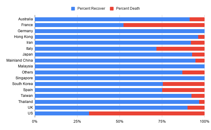
What is this telling us? For the resolved cases in each country, the blue represents people who had the disease and got better. The red represents people who had the disease and died. The ones who still have the disease aren’t included at all. These are all percents, not actual numbers.
Maybe I’m missing something. I tried to weed out the outliers. I tried to get rid of the countries with sample sizes that are too small, or ones that aren’t far enough along to have significant recovery data.
And I don’t want to politicize this. I know some people could look at this graph and point out that the US purposefully and intentionally scaled back its ability to handle a pandemic. Or that the unavailability of test kits means that the situation is actually a lot worse than it appears, because you can’t confirm cases of infection without testing. At some point, medicare for all and Obamacare and socialism are going to work their way into this conversation. And they probably should.
But right now, I think we should take John Oliver’s advice. Be a bit concerned. Don’t be complacent, and don’t be an idiot. That’s what we’re trying to do in the schools right now.
Further Reading:
- CDC Guidance for Schools
- Ohio Department of Health COVID-19 Resources
- Johns Hopkins Map
- Education Week: How to Respond to Coronavirus: 6 Steps for Schools
- Kids Comic
Update – March 15, 2020:
It has been a week since I posted this. In the last seven days, the world has changed dramatically. Schools are closed for the next 3 weeks. The governor banned all gatherings of more than 100 people on Thursday. Today, all bars and restaurants are being ordered closed.
I re-ran the numbers based on what is available today, and generated an updated version of the graph posted above. The new graph is a LOT worse. But I’m not going to post it. It has become abundantly clear that these numbers aren’t reliable. The shortage of testing capacity in the United States means that the test results only represent those who are exhibiting the most severe symptoms. In short, the reason we don’t have more cases is because we’re not testing people with minor symptoms. That’s also why the death rate is so high.
On Wednesday, Governor DeWine said that once there are two community-spread cases identified, we can assume that 1% of the population is infected. On Thursday, he said that we can expect the number of cases to double every six days. If these numbers are accurate, we’re going to have hundreds of thousands of people infected. If the mortality rate is really in the ranges we’re seeing, this virus is going to kill more Americans than any war we’ve ever had.
I don’t think that’s the case. I think the extraordinary measures that are being employed are going to work. But these are certainly extraordinary times.
Image Credit: NIAID Integrated Research Facility on Flickr
