John Hattie wanted to answer a very simple question. We’ve been studying school improvement for decades. We’ve tried all kinds of new initiatives, programs, philosophies, and approaches to improve student learning. We’ve spent millions of dollars on research, and thousands of graduate students have wrestled with the question of how to make our schools more effective. If we really want to improve student learning, where should we focus our efforts?
He started by looking at the research, but there was too much research. So he looked at the analysis of the research. These meta-analyses examine the body of research within a specific field, and try to draw general conclusions based on the results of many individual studies. By examining many of these meta-analyses, Hattie found that he could generalize the effects of many different educational initiatives and instructional factors, and compare them to one another.
He initially studied 800 of these meta-analyses, and compared 138 different factors that could influence student learning. He later expanded this to 195 factors addressed in 1200 meta-analyses. He used a lot of math that I don’t understand to rate the “effect size” of each factor. That is, how much did the factor impact student learning, either in a positive or a negative way?
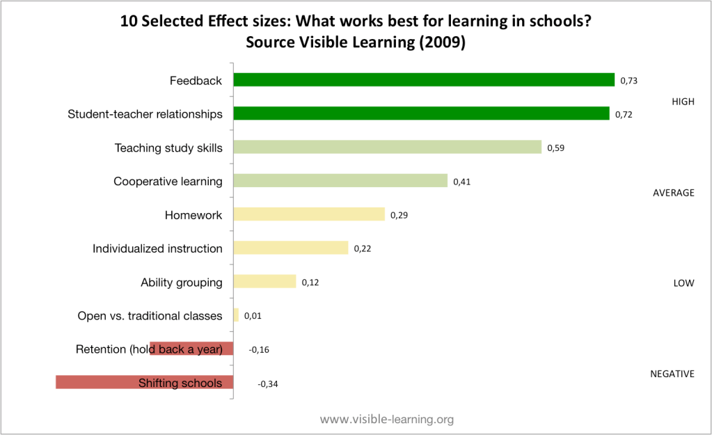
He found that most things have a small positive effect (average effect size of 0.40). A few things have a negative effect. Some things have a larger positive effect. If you’ve seen any kind of keynote speaker talking about education in the last ten years, you’ve probably seen a slide like this:

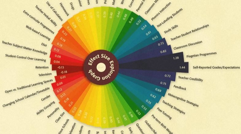
With 195 factors on the list, it’s impractical to include everything. You’ll often see ability grouping, class size, and homework on the list (all of which have a tiny positive effect compared to things like student agency and student-teacher relationships. This infographic does a really good job of illustrating 50 factors, including seven that we should focus on and seven that we shouldn’t be worrying about.
This is compelling work. It helps schools prioritize their efforts to improve learning. It shows them where their efforts can have the greatest positive impact. And it’s research-based. More than 1200 research studies have fueled these conclusions. This is the tl;dr of education research, all wrapped up in one convenient infographic.
But can we trust it?
Hattie is a well-respected researcher. But as Bergeron has asserted, by looking at analyses of analyses of research studies, he’s forced to overlook the nuances of the individual studies. Not all research is conducted with fidelity. There are flawed designs, confounding variables, and incorrect conclusions. There are mistakes in statistical analyses and questionable interpretations of the data. The volume of research also varies widely from topic to topic, so some conclusions are based on a relatively small sample of data. And despite researchers’ best efforts, correlation and causation are often confused. The local ice cream shop does more business on hot summer days. But that doesn’t mean that hot weather is caused by ice cream consumption.
It’s not as simple as saying that class sizes and homework aren’t important. We should instead focus on student agency and fostering caring, respectful relationships between our students and their teachers.

DeWitt contends that we shouldn’t simply be looking at Hattie’s work as a reason for focusing on the factors with the largest effect size at the expense of everything else we’re doing in schools. He argues that we should be using Hattie’s research to inform our own evidence-based analysis of our practices. We can use this work as a lens through which we can examine our own practices. As we look at the things that are working and not working in our schools, how do they align with the conclusions Hattie has drawn? What are the missing pieces that we should be giving increased attention?
More importantly, perhaps, is for students to see us struggling with complex ideas. Improving learning is not as simple as looking at an ordered list of factors and concentrating on those that will have the greatest impact. It’s a complex system with many interdependent variables, and this is one framework for examining that system and looking for ways to improve it. Our students need to see more models like that. Solving climate change, and health care, and energy dependence, and the economic impact of changing demographics, and social inequity are all complex, challenging problems. They don’t have easy solutions. They don’t have distilled frameworks that can be boiled down into neat infographics.
Letting our students see how we struggle to make schools better gives them one example of a model that they’re going to be seeing a lot of.
